Boxplot Analysis
Boxplot analysis can visually summarize data’s spread, symmetry, and outliers.
1. Key Terms to Know
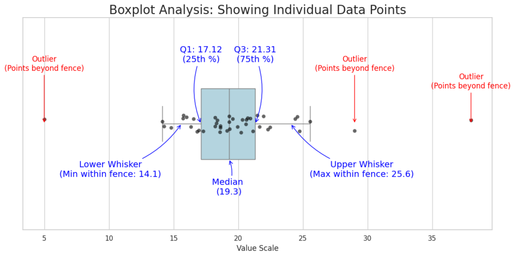
Interquartile Range (IQR): IQR = Q3 – Q1. This is the “box” itself. It represents the middle 50% of the data.
Outliers: Data points that fall far outside the expected range. In most software, an outlier is any point more than 1.5 X IQR away from the edges of the box.
Whiskers: The most common method for determining whiskers is the Tukey Boxplot method, which uses the 1.5 X IQR.
Component | What it Represents |
|---|---|
| Lower Whisker (Lower Fence) | Q1 – (1.5 X IQR) |
| First Quartile (Q1) | The 25th percentile; 25% of the data falls below this point. |
| Median (Q2) | The middle value; 50% of the data falls above and 50% below. |
| Third Quartile (Q3) | The 75th percentile; 75% of the data falls below this point. |
| Upper whisker (uppwer fence) | Q3 + (1.5 X IQR) |
2. How to Interpret the Analysis
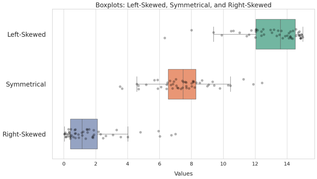
2.1 Analyzing Skewness
Left-Skewed: The lower (left) whisker is longer, and the median is closer to the right of the box.
Symmetrical: The whiskers are roughly the same length, and the median is in the center of the box.
Right-Skewed: The upper (right) whisker is longer, and the median is closer to the left of the box.
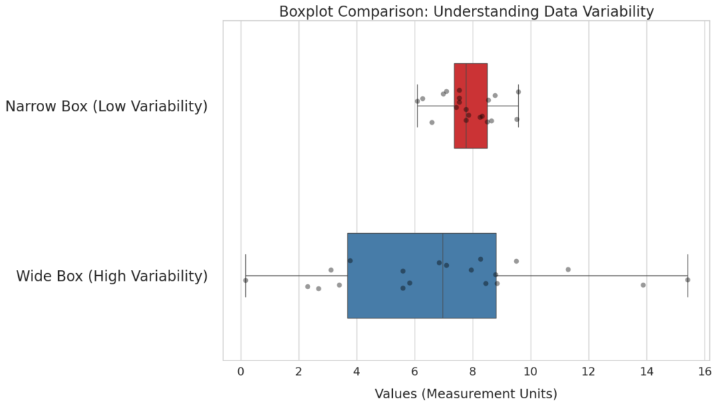
2.2 Analyzing Variability
Narrow Box: Indicates the data is very consistent and tightly grouped around the median.
Wide Box: Indicates high variability; the data points are spread out across a large range.
Further Reading
You can refer to another tutorial on the difference between left-skewed and right-skewed. Further, you can find the Python code being used to plot the boxplot analysis.
Discussion