How to Plot Shaded Area in R (3 Examples)
This tutorial shows how to plot a shaded area in R using 3 examples. In particular, I am going to show how you can add a shaded area under a normal distribution curve (i.e., a bell-shaped curve).
You can use the geom_polygon() to add the shade. The basic syntax is as follows.
geom_polygon(data = data.frame(x=x_col, y=y_col), aes(x_col, y_col))
Examples of plot shaded area in R for bell-shaped curves
Example 1: plot shade for standard normal distribution
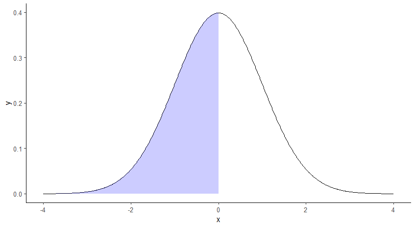
We can add a shaded area under the curve of standard normal distribution. The following is to plot to illustrate the meaning of pnorm(0, 0, 1).
pnorm(0, 0, 1) returns the value of 0.5, which is the probability for the quantile of 0 in a standard normal distribution.
The following R code is to plot the area representing the probability of 0.5, under the bell-shaped curve of standard normal distribution.
# import ggplot
library(ggplot2)

# x-axis and y-axis for the pdf line
x <- seq(-4,4,0.01)
y <- dnorm(x)

# x-axis and y-axis for the shaded area
x_shaded <- seq(-4, 0, 0.01)
y_shaded <- c(dnorm(x_shaded),0)
x_shaded <- c(x_shaded, 0)

# plot it, alpha sets the level of transparency in color
ggplot() + geom_line(aes(x, y)) +geom_polygon(data = data.frame(x=x_shaded, y=y_shaded), aes(x_shaded, y_shaded),fill = "blue", alpha = 1/5)+
theme(panel.background = element_rect(fill='transparent'),
  axis.line.x = element_line(color="black", size = 0.5),
  axis.line.y = element_line(color="black", size = 0.5))
The following is the plot.
Note that, the following part of the code is optional, as it is just to make the background transparent and add the lines for the x-axis and the y-axis.
theme(
panel.background = element_rect(fill='transparent'),
  axis.line.x = element_line(color="black", size = 0.5),
  axis.line.y = element_line(color="black", size = 0.5))
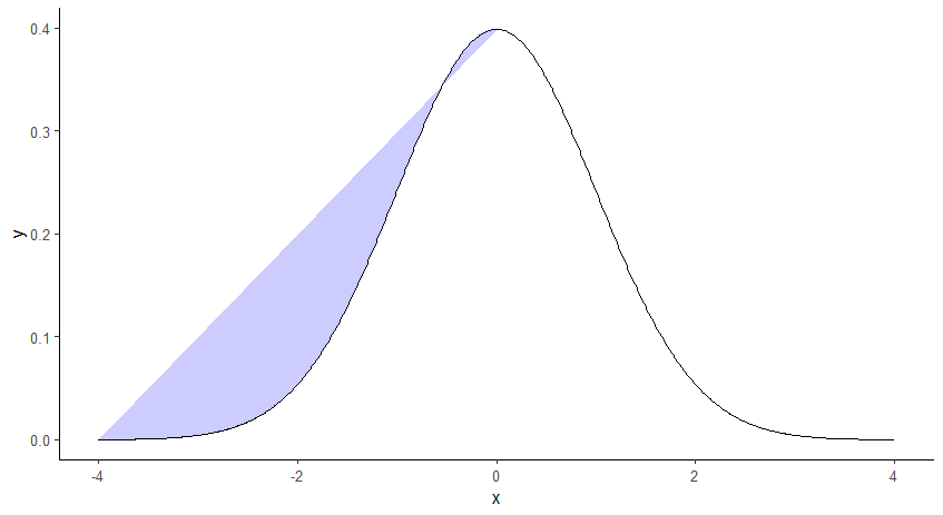
If without the manually added point of (0, 0) in the data frame for geom_polygon(), the plot will look as follows.
Example 2: plot shade for standard normal distribution
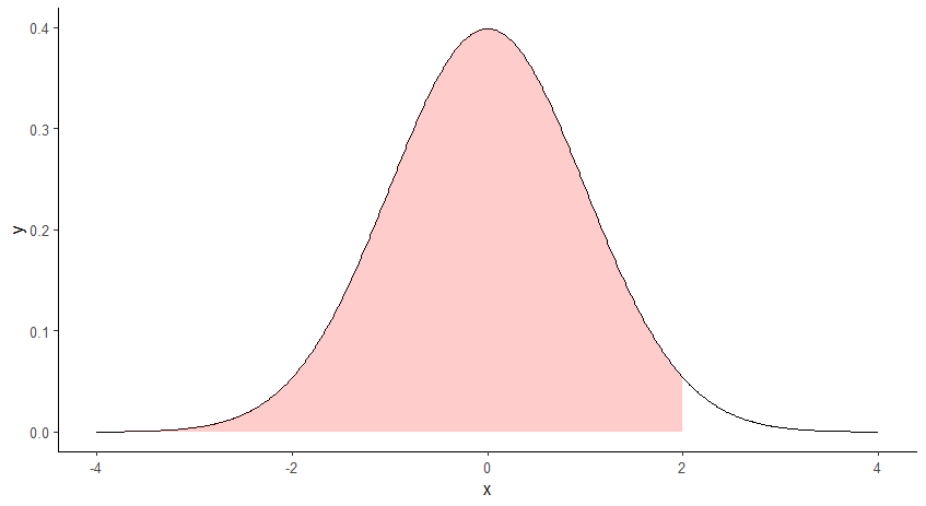
The following is to plot to illustrate the meaning of pnorm(2, 0, 1).
pnorm(2, 0, 1) returns the value of 0.977, which is the probability for the quantile of 2 in a standard normal distribution.
The following R code is to plot the area representing the probability of 0.977, under the bell-shaped curve of standard normal distribution.
# import ggplot
library(ggplot2)

# x-axis and y-axis for the pdf line
x <- seq(-4,4,0.01)
y <- dnorm(x)

# x-axis and y-axis for shaded area
x_shaded<- seq(-4, 2, 0.01)
y_shaded <- c(dnorm(x_shaded),0)
x_shaded<-c(x_shaded,2)

# plot it, alpha sets the level of transparency in color
ggplot() + geom_line(aes(x, y))+geom_polygon(data = data.frame(x=x_shaded, y=y_shaded), aes(x_shaded, y_shaded),fill = "red",alpha = 1/5)+
theme(panel.background = element_rect(fill='transparent'),
  axis.line.x = element_line(color="black", size = 0.5),
  axis.line.y = element_line(color="black", size = 0.5))
The following is the plot.
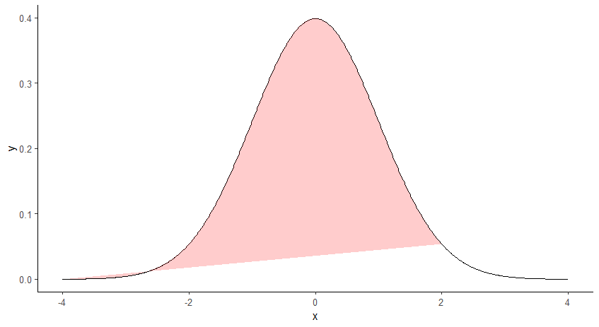
If without the manually added point of (2, 0) in the data frame for geom_polygon(), the plot will look like the below.
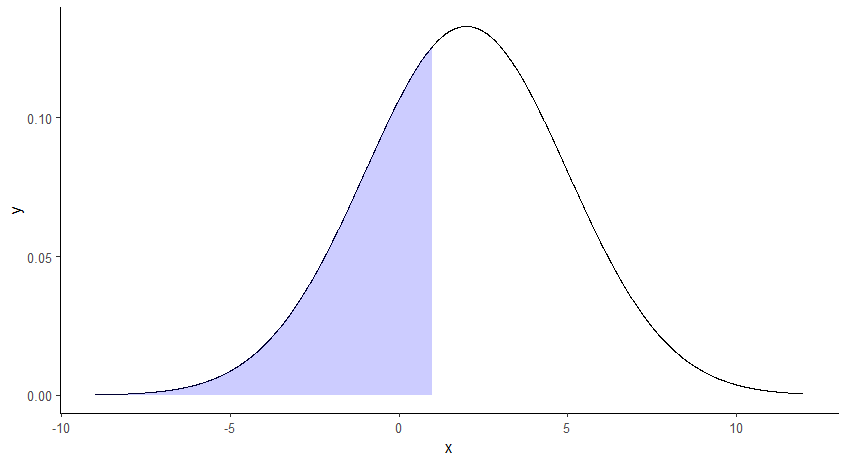
Example 3: plot shaded area for the non-standard normal bell-shaped curve in R
All the examples above plot standard normal distribution (i.e., mean = 0, sd= 1). In contrast, Example 3 will show how you can plot a non-standard normal distribution.
In particular, we are going to plot a normal distribution with mean = 2 and sd =3. Further, we are going to plot the shaded area from the left tail to the point of 1.
In addition, you might notice that I additionally add the point of (1, 0) into the data frame. The reason is similar to what I have mentioned in Examples 1 and 2. The following is the R code.
# import ggplot
library(ggplot2)

# x-axis and y-axis for the pdf line
x <- seq(-9,12,0.01)
y <- dnorm(x,2,3)

# x-axis and y-axis for the shaded area
x_shaded <- seq(-9, 1, 0.01)
y_shaded <- c(dnorm(x_shaded,2,3),0)
x_shaded <- c(x_shaded, 1)

# plot it, alpha sets the level of transparency in color
ggplot() + geom_line(aes(x, y)) +geom_polygon(data = data.frame(x=x_shaded, y=y_shaded), aes(x_shaded, y_shaded),fill = "blue", alpha = 1/5)+ theme(
  panel.background = element_rect(fill='transparent'),
  axis.line.x = element_line(color="black", size = 0.5),
  axis.line.y = element_line(color="black", size = 0.5))
The following is the plot.
