How to Plot 2-Way ANOVA Interaction in R (with Example)
This tutorial shows how to plot the figure for the interaction in 2-way ANOVA in R.
Steps of Plotting 2-Way ANOVA Interaction in R
Step 1: Prepare the data
The following is the data being used for the examples. It has two categorical variables (i.e., City and Brand) and one continuous variable (i.e., sales).
# download the data from Github
df <- read.csv("https://raw.githubusercontent.com/TidyPython/interactions/main/city_brand_sales.csv")

# print out the data
print(df)
Output:
    City  Brand sales
1  City1 brand1    70
2  City1 brand2    10
3  City1 brand1   100
4  City1 brand2     2
5  City1 brand1    30
6  City1 brand2     2
7  City1 brand1    20
8  City1 brand2    10
9  City1 brand1    20
10 City1 brand2    10
11 City2 brand1     9
12 City2 brand2    10
13 City2 brand1     5
14 City2 brand2     4
15 City2 brand1     4
16 City2 brand2     4
17 City2 brand1     5
18 City2 brand2     4
19 City2 brand1    12
20 City2 brand2    11
Step 2: Calculate the means
The following uses dplyr to calculate means grouped by two categorical variables, City and Brand. For more about how to calculate means grouped by columns, see my other tutorial.
# use dplyr to calculate means grouped by City and Brand
means=df%>% group_by(City,Brand) %>% summarise_at(vars(sales), list(Sales_means = mean))

# print out the table of means
print(means)
Output:
# A tibble: 4 x 3
# Groups:   City [2]
  City  Brand  Sales_means
  <chr> <chr>        <dbl>
1 City1 brand1        48
2 City1 brand2         6.8
3 City2 brand1         7
4 City2 brand2         6.6
Step 3: Use ggplot to plot the ANOVA interaction
# import ggplots
library(ggplot2)

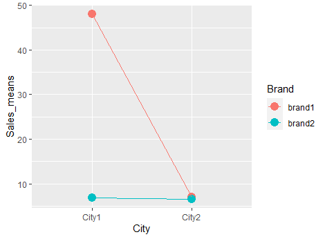
# use ggplot to plot the interaction of 2-way ANOVA
ggplot(means,
       aes(x = City, y = Sales_means, colour = Brand, group = Brand)) +
  geom_point(size = 4) + geom_line()
Output:

Step 4: add theme to make it prettier
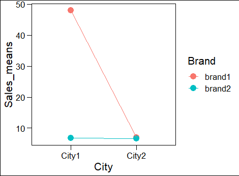
We can use theme to remove the background color to make the plot look better. We use theme_base(). For more about different themes, please refer to this page.
# Install, if you have not installed ggthemes
# install.packages("ggthemes")

# load ggthemes
library(ggthemes)

# add theme_base() at the end
ggplot(means,
       aes(x = City, y = Sales_means, colour = Brand, group = Brand)) +
  geom_point(size = 4) + geom_line()+theme_base()
Output:
