How to Plot Multiple t-distribution Bell-shaped Curves in R
This tutorial shows how you can plot multiple t-distribution bell-shaped curves in R. In short, it is a combination of dt(), plot(), and lines().
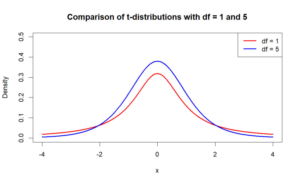
Example 1 of plotting multiple t-distribution bell-shaped curves
The following is the R code to plot two t-distribution bell-shaped curves, with degree freedom of 1 and 5.
# Set the degrees of freedom
df1 <- 1
df2 <- 5

# Create a sequence of values to use as x-coordinates
x <- seq(-4, 4, length.out = 1000)

# Calculate the corresponding y-coordinates using the dt() function
y1 <- dt(x, df1)
y2 <- dt(x, df2)

# Plot the curves using the plot() function
plot(x, y1, type = "l", lwd = 2, col = "red", xlab = "x", ylab = "Density",
     main = "Comparison of t-distributions with df = 1 and 5",ylim = c(0, 0.5))
lines(x, y2, lwd = 2, col = "blue")
lines(x, y3, lwd = 2, col = "yellow")
legend("topright", legend = c(paste0("df = ", df1), paste0("df = ", df2)),lty = 1, lwd = 2, col = c("red", "blue"))
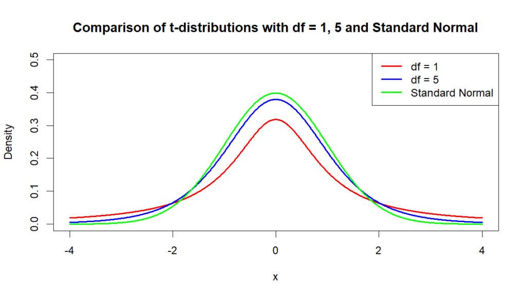
Example 2 of plotting multiple t-distribution bell-shaped curves
We can also compare t-distribution bell-shaped curves and standard normal distribution bell-shaped curves. The following R code plots both t-distribution and standard normal distribution curves.
# Set the degrees of freedom
df1 <- 1
df2 <- 5

# Create a sequence of values to use as x-coordinates
x <- seq(-4, 4, length.out = 1000)

# Calculate the corresponding y-coordinates using the dt() and dnorm() functions
y1 <- dt(x, df1)
y2 <- dt(x, df2)
ynorm <- dnorm(x)

# Plot the curves using the plot() function
plot(x, y1, type = "l", lwd = 2, col = "red", xlab = "x", ylab = "Density",
     main = "Comparison of t-distributions with df = 1, 5 and Standard Normal",ylim = c(0, 0.5))
lines(x, y2, lwd = 2, col = "blue")
lines(x, ynorm, lwd = 2, col = "green")
legend("topright", legend = c(paste0("df = ", df1), paste0("df = ", df2), "Standard Normal"),
       lty = 1, lwd = 2, col = c("red", "blue","green"))