How to Create Scatter Plots in SPSS
This tutorial shows how you can create scatter plots in SPSS in 5 steps. In addition, it shows how to add a fit line in SPSS.
Note that, the tutorial is based on SPSS 31; if you are using a different version of SPSS, the interfaces might look a bit different, but it should not impact the core principle of how to do it.
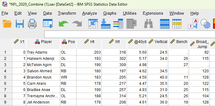
We are going to use the NFL data 2020 combine data for this correlation analysis. In particular, we want to see whether there is a relationship between athletes’ height (Ht) and weight (Wt).
The following is the screenshot of the data, and you can download the dataset of ![]() NFL 2020 combine data here. The columns of height (Ht) and weight (Wt) are shown in the follow screenshot.
NFL 2020 combine data here. The columns of height (Ht) and weight (Wt) are shown in the follow screenshot.
1. Steps of Scatter Plot in SPSS
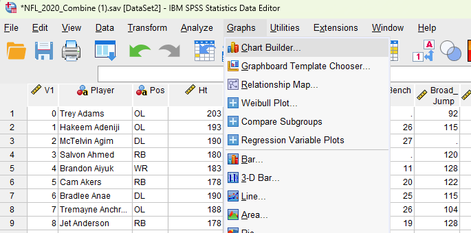
- Click Graphs and then click Chart Builder.
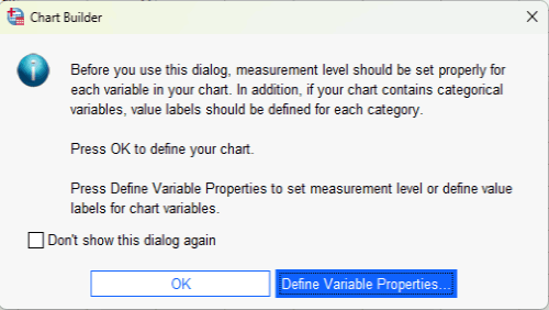
- Click OK. Note that, you might not see this pop up windown, depending on the SPSS version and/or your previous settings in SPSS.
- Click Scatter / Dot on the left (see the red circle), and then double click
 (i.e., Scatter Plot).
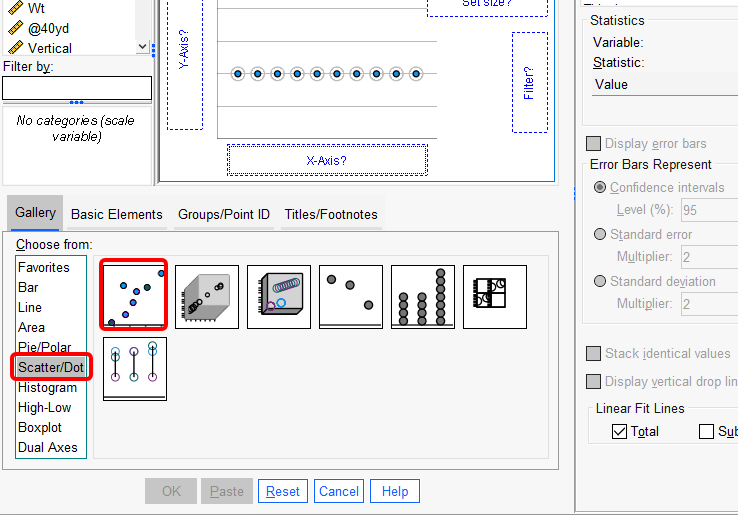
- Drag Ht to the x-axis and drag Wt to the y-axis. ou can exchange the positions if you want, depending on your focus or theory. Then, hit
 button at the bottom of the interface.
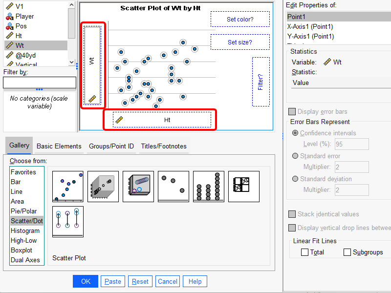
2. Output and Interpretation of scatter plots
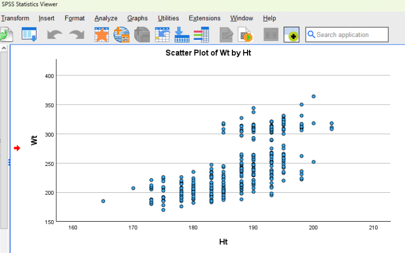
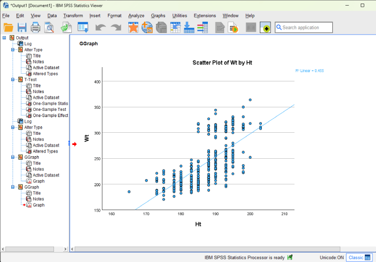
The following is the final output. As you can see, there is a positive relationship between Ht (height) and Wt (weight). That means, as the athletes are taller, their weight numbers are greater.
3. Optional Step: Add a linear fit line in scatter plots
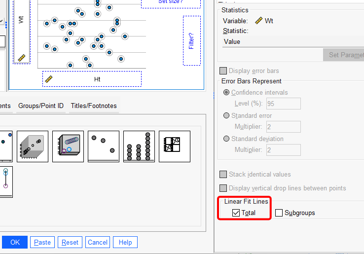
We can also add a linear fit line in scatter plots in SPSS by selecting the option of “Total”, see below. (Note that, you might not see this option in other versions of SPSS. ) Then, click ![]() .
.
Below that, we can see the scatter plot with a linear fit line. You can also see that there is r-square information, namely “R2 Linear = 0.455″. It means that Ht explains a 45.5% variance of Wt.
Further Reading
The following is another tutorial on plotting in SPSS. In particular, it is about plotting interaction of categorical variables for continuous dependent variable in SPSS.