Johnson Neyman in R (2 detailed examples)
This tutorial explains how you can do Johnson Neyman in R. You can use the package of “interactions” in R do Johnson Neyman in R. The following is the key R syntax.
library(interactions)
model <- lm(Y ~ X * M, data = data_file_name)
johnson_neyman(model = model, pred = X,  modx = M)
The meaning of Johnson Neyman plot (or, purpose)
Assuming the following is our model with variables of X, M, and Y. We can calculate the partial derivative of Y with respect to X.
\[ Y=b_0+b_1X+b_2M+b_3XM \]
\[ \frac{\partial Y}{\partial X} =b_1+b_3M \]
Johnson Newyman will tell you at which point of M, X can significantly predict Y.
In the package of “interactions”, it will plot \( \frac{\partial Y}{\partial X} \) as Y-axis and M as X-axis. Thus, the slope of the Johnson Neyman plot is the regression coefficient of \( b_3 \).
Examples of Johnson Neyman in R
Johnson Neyman is typically used when the interaction moderator (i.e., M) is a continuous variable. In Example 1, we are going to test when both X and M are continuous variable. In Example 2, X is categorical and M is continuous.
Y=β0+β1X+β2M+β3X×M
| Example | X | M |
|---|---|---|
| Example 1 | Continuous | Continuous |
| Example 2 | Categorical | Continuous |
Example 1 for Johnson Neyman in R
Part 1: R code
We are going to use R built-in dataset mtcars. In particular, X is hp (Gross horsepower), and moderator is wt (Weight (1000 lbs)). The Y is mpg (Miles/(US) gallon).
Note that, all hp, wt, and mpg are continuous variables. The following is the R code.
# import the package
library(interactions)

# linear model for Example 1
example_1 <- lm(mpg ~ hp * wt, data = mtcars)

# print out the linear regression results
summary(example_1)

# use johnson_neyman from the package of "interactions"
johnson_neyman(model = example_1 , pred = hp, modx = wt)
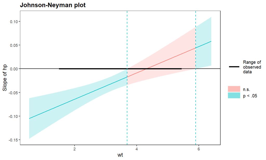
The following is the text output for the model and Johnson Neyman plot. We can see that the interaction effect is significant, p=0.000811.
> summary(example_1)

Call:
lm(formula = mpg ~ hp * wt, data = mtcars)

Residuals:
    Min      1Q  Median      3Q     Max
-3.0632 -1.6491 -0.7362  1.4211  4.5513

Coefficients:
            Estimate Std. Error t value Pr(>|t|)
(Intercept) 49.80842    3.60516  13.816 5.01e-14 ***
hp          -0.12010    0.02470  -4.863 4.04e-05 ***
wt          -8.21662    1.26971  -6.471 5.20e-07 ***
hp:wt        0.02785    0.00742   3.753 0.000811 ***
---
Signif. codes:  0 ‘***’ 0.001 ‘**’ 0.01 ‘*’ 0.05 ‘.’ 0.1 ‘ ’ 1

Residual standard error: 2.153 on 28 degrees of freedom
Multiple R-squared:  0.8848,	Adjusted R-squared:  0.8724
F-statistic: 71.66 on 3 and 28 DF,  p-value: 2.981e-13

>
> johnson_neyman(model = example_1 , pred = hp, modx = wt)
JOHNSON-NEYMAN INTERVAL

When wt is OUTSIDE the interval [3.69, 5.90], the slope of hp is p < .05.

Note: The range of observed values of wt is [1.51, 5.42]

Part 2: The meaning of the Johnson Heyman plot
In the plot shown above, the green color is p<0.05, meaning significant. That is, when wt < 3.69 or wt > 5.90, the effect of hp on mpg is significant.
In particular, when wt < 3.69, the effect of hp on mpg is negative (i.e., left-hand side of the plot). That means, when wt < 3.69, more horsepower will lead to lower Miles/gallon.
When wt > 5.90, the effect of hp on mpg is positive (i.e., right-hand side of the plot). That means, when wt > 5.90, more horsepower will lead to higher Miles/gallon.
Finally, for the red color region (i.e., wt = [3.69, 5.90]), the effect of hp on mpg is not significant. That means, when wt = [3.69, 5.90], different housepowers basically have the same Miles/gallon.
Example 2 for Johnson Neyman in R
Part 1: R code
In Example 2, M is continuous variable (variable name: socst; meaning: social science scores) and X is categorical variable (variable name: Gender_dummy). Y is writing score (variable name: write).
# read data from GitHub
hsbdemo <- read.csv(file = 'https://raw.githubusercontent.com/TidyPython/SPSS/main/hsbdemo.csv')

# write out the linear model for Example 2
example_2 <- lm(write ~ Gender_dummy * socst, data = hsbdemo)

# print out the linear regression result
summary(example_2)

# use johnson_neyman from the package of "interactions"
johnson_neyman(model = example_2, pred = Gender_dummy,
               modx = socst)
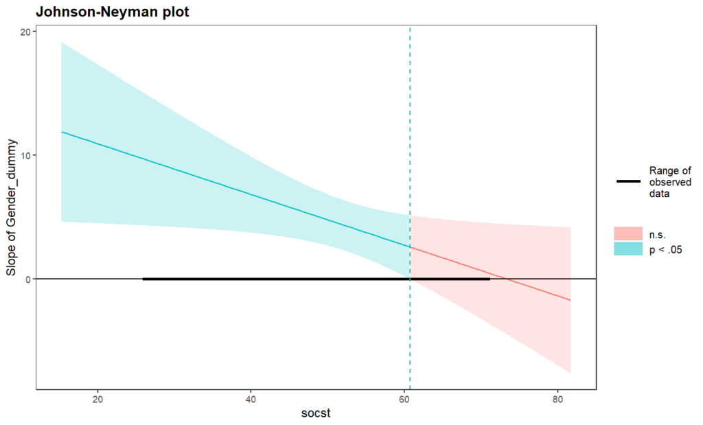
The following is the text output for the model and Johnson Neyman plot. We can see that the interaction effect is significant, p=0.03305.
> summary(example_2)

Call:
lm(formula = write ~ Gender_dummy * socst, data = hsbdemo)

Residuals:
     Min       1Q   Median       3Q      Max
-18.6265  -4.3108  -0.0645   5.0429  16.4974

Coefficients:
                   Estimate Std. Error t value Pr(>|t|)
(Intercept)        17.76190    3.55499   4.996 1.29e-06 ***
Gender_dummy       15.00001    5.09795   2.942  0.00365 **
socst               0.62480    0.06707   9.315  < 2e-16 ***
Gender_dummy:socst -0.20473    0.09537  -2.147  0.03305 *
---
Signif. codes:  0 ‘***’ 0.001 ‘**’ 0.01 ‘*’ 0.05 ‘.’ 0.1 ‘ ’ 1

Residual standard error: 7.212 on 196 degrees of freedom
Multiple R-squared:  0.4299,	Adjusted R-squared:  0.4211
F-statistic: 49.26 on 3 and 196 DF,  p-value: < 2.2e-16

>
> johnson_neyman(model = example_2, pred = Gender_dummy,
+                modx = socst)
JOHNSON-NEYMAN INTERVAL

When socst is OUTSIDE the interval [60.74, 312.10], the slope of Gender_dummy is p < .05.

Note: The range of observed values of socst is [26.00, 71.00]

Part 2: The meaning of the Johnson Heyman plot
The green color region means significant (p < 0.05). That is, when socst (social science sores) < 60.74, the effect of Gender on writing scores is significant.
Further, we can see more green region’s Y value (i.e., slope of Gender_dummy) is positive (i.e., >0). It means tha, when socst (social science sores) < 60.74, females (dummy coding = 1) have higher writing scores than males (dummy coding = 0)
In contrast, for the red color region (i.e., socst > 60.74), the effect of gender on write is not significant. That means, when socst > 60.74, males and females do not differ in writing scores.