Plot Interaction Effects of Categorical Variables in SPSS
This tutorial shows how you can plot interactions of categorical variables in SPSS. That is, the 2 independent variables (IVs) are categorical variables and the dependent variable is numerical.
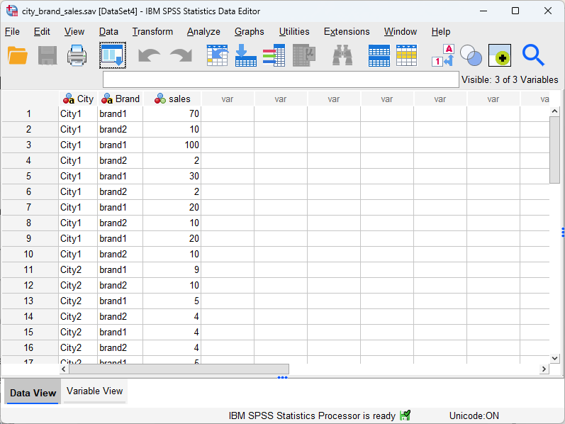
Since both of the IVs (City and Brand, see the figure below) are categorical variables, we are going to use bar charts to plot the interaction effect. For this tutorial, you can ![]() download the dataset of categorical independent variables from this GitHub link to practice.
download the dataset of categorical independent variables from this GitHub link to practice.
1. Steps of Plotting Interaction Effects of Categorical Variables
The following demonstrates the 8 steps of plotting the interaction effect of two categorical indedependent variables (the DV of sales is a continuous variable) in SPSS.
- Click Graphs
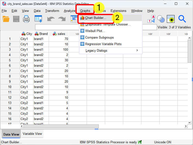
- Click Chart Builder
- Select Bar
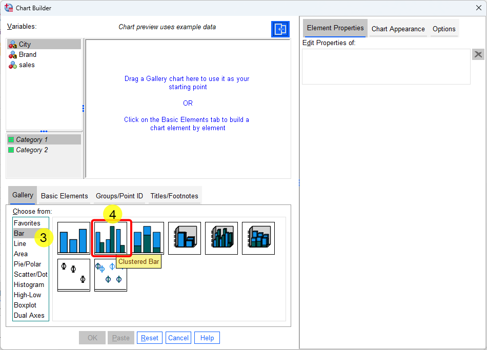
- Double Click “Clustered Bar.” After the double click, the framework of bar chart will pop up, see below. Note that, all the Y-axis, X-axis and “Cluster on X: set color” are empty and we need to drag corresponding variables into thoese boxes (see the next steps).
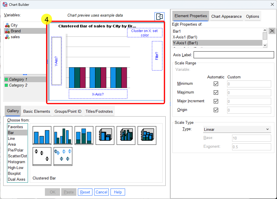
- Drag the dependent variable (i.e., DV of sales) on the y-axis box
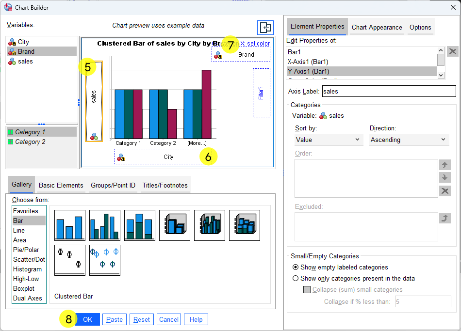
- Drag one categorical IV (e.g., City) into the x-axis box
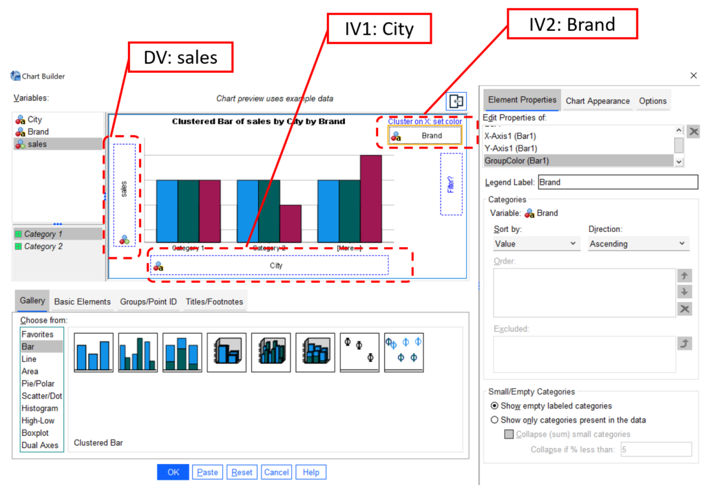
- Drag the other categorical IV (e.g., Brand) into the “Cluster on X set color.” The following figure shows labels for conceptual names: DV: Sales, IV1: City, and IV2: Brand.
- Finally, click OK.
2. Final Plot Figure and Interpretation
Then, we can see the final plot shown below. We can see that IV1 City is on the x-axis, whereas IV2 Brand is the legend, which uses two different colors (Blue and Green) to indicate two brands. The y-axis is the dependent variable of sales.
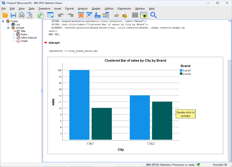
One way to interpret the interaction plot (or, interaction effect) is based on mean differences. We can calculate the means of 4 cells to understand the meaning of the interaction. We can use the following table to better summarize the results.
In particular, for Brand 1, the sales difference between City 1 and City 2 is 41.1. For Brand 2, the difference is 0.2. Therefore, a significant interaction means that 0.2 and 41.1 are statistically significant.
| Brand 1 | Brand 2 | |
| City 1 | 48.0 | 6.8 |
| City 2 | 7.0 | 6.6 |
| Difference between City 1 and City 2 | 48.0-7.0=41.0 | 6.8-6.6=0.2 |